
Email Design System
Brand new email design system built for a tier 1 financial company covering a wide range of email templates sent externally throughout the firm.
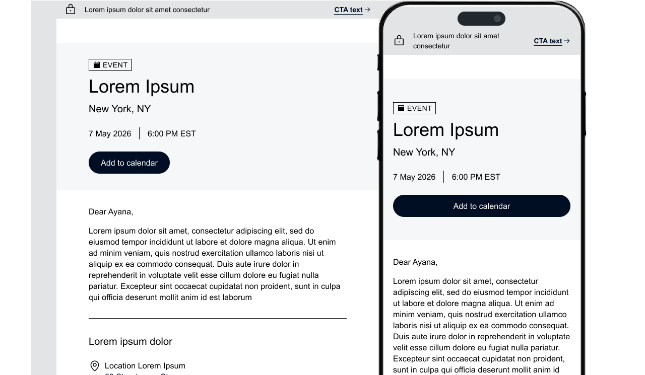
A brand new email design system built from scratch for a Tier 1 Financial Company as part of a firm-wide brand refresh, covering hundreds of different email templates sent externally.
Stakeholders wanted a new email design system that matched their new brand guidelines as part of a brand refresh for all marketing in the firm.
The system had to be technically capable across different EMSs (electronic mail systems) including Outlook and Gmail, and built for both desktop and mobile formats.
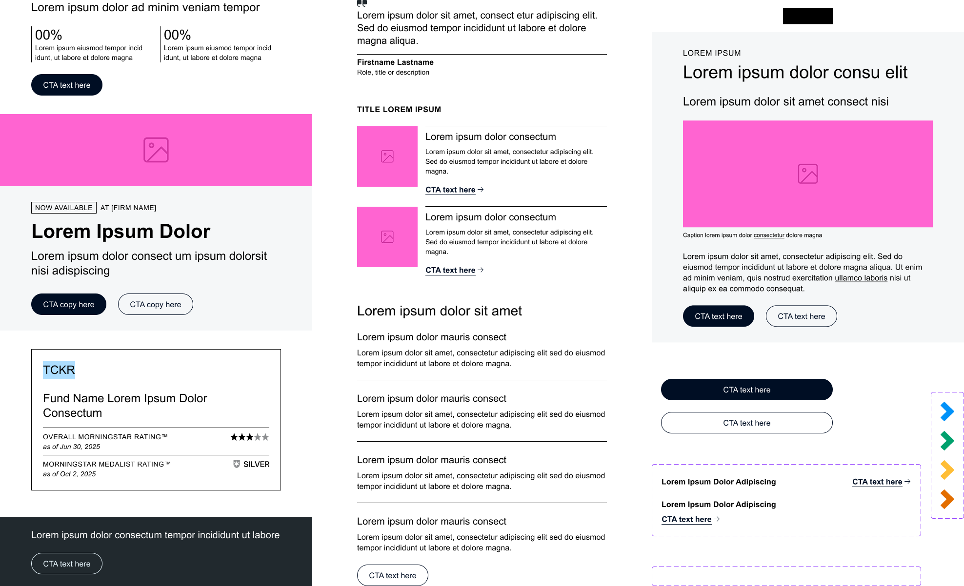
Featured components out of our extensive library.
How We Built It
The process was iterative and grounded in the existing email landscape before anything new was designed.
Auditing Existing Templates
- Dissected existing templates into elements and components
- Component list evolved frequently throughout the project
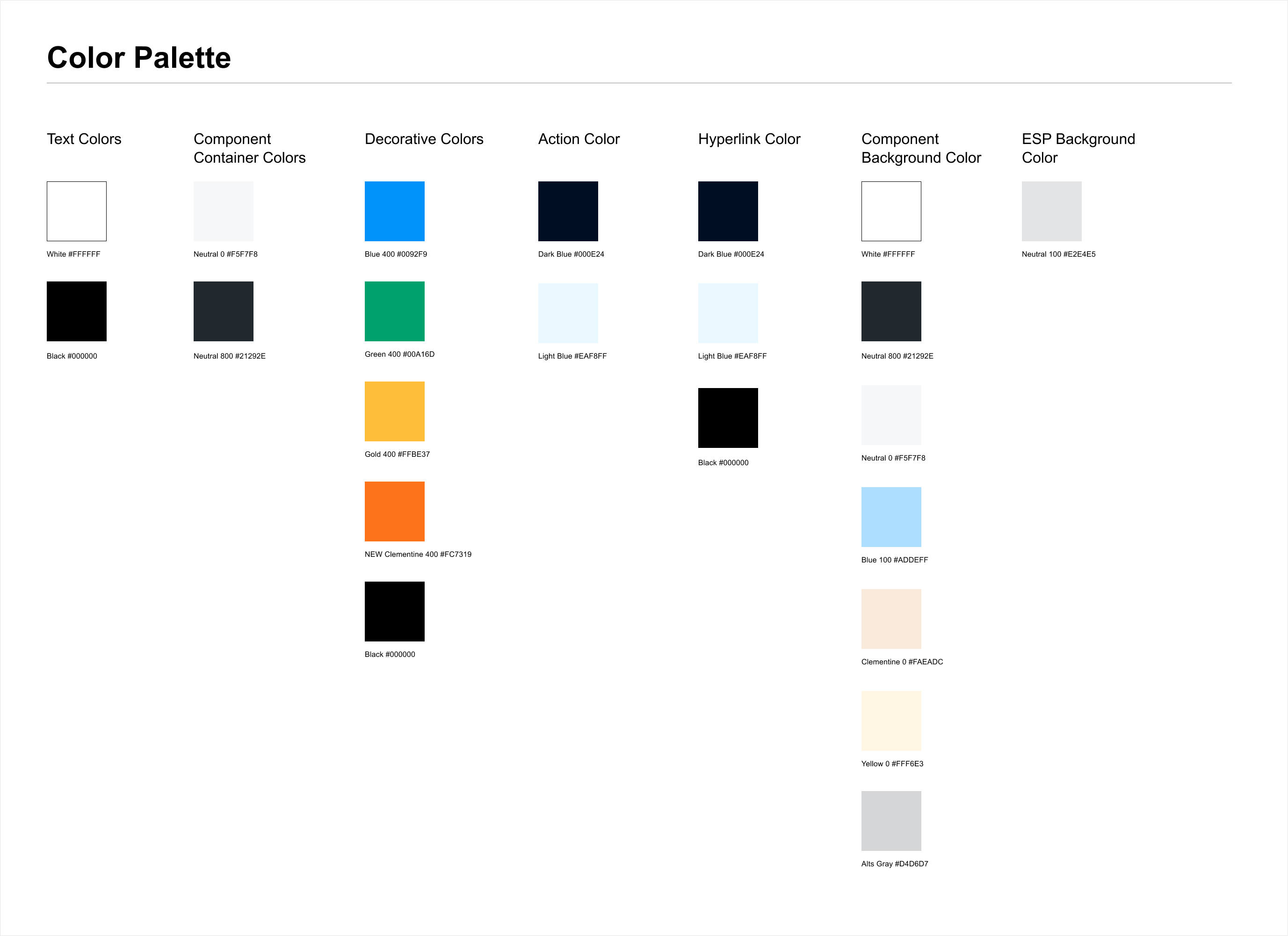
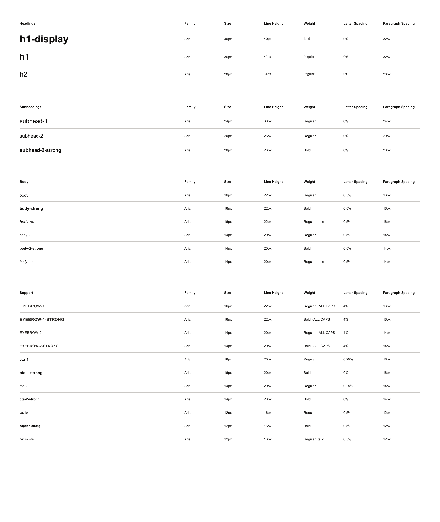
Base Layer: Color and Typography
- Established color and type tokens aligned to new brand guidelines
- Both iterated frequently as the brand refresh evolved
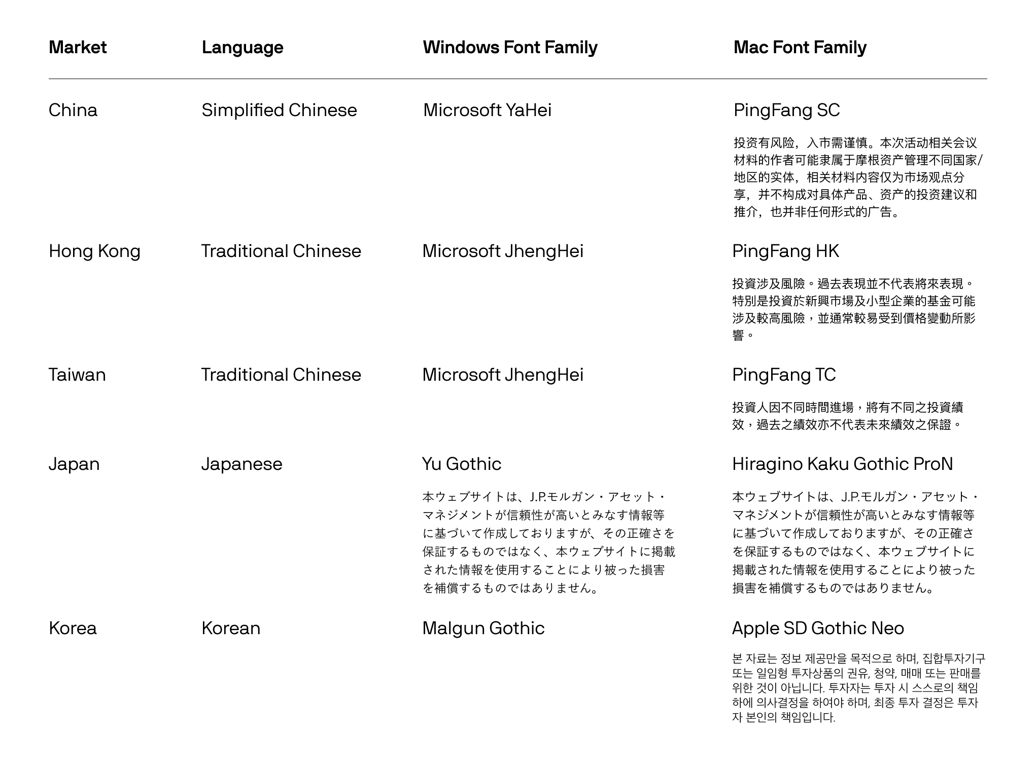
- Late requirement: typography expanded to support Asian language fonts
Grid and Spacing
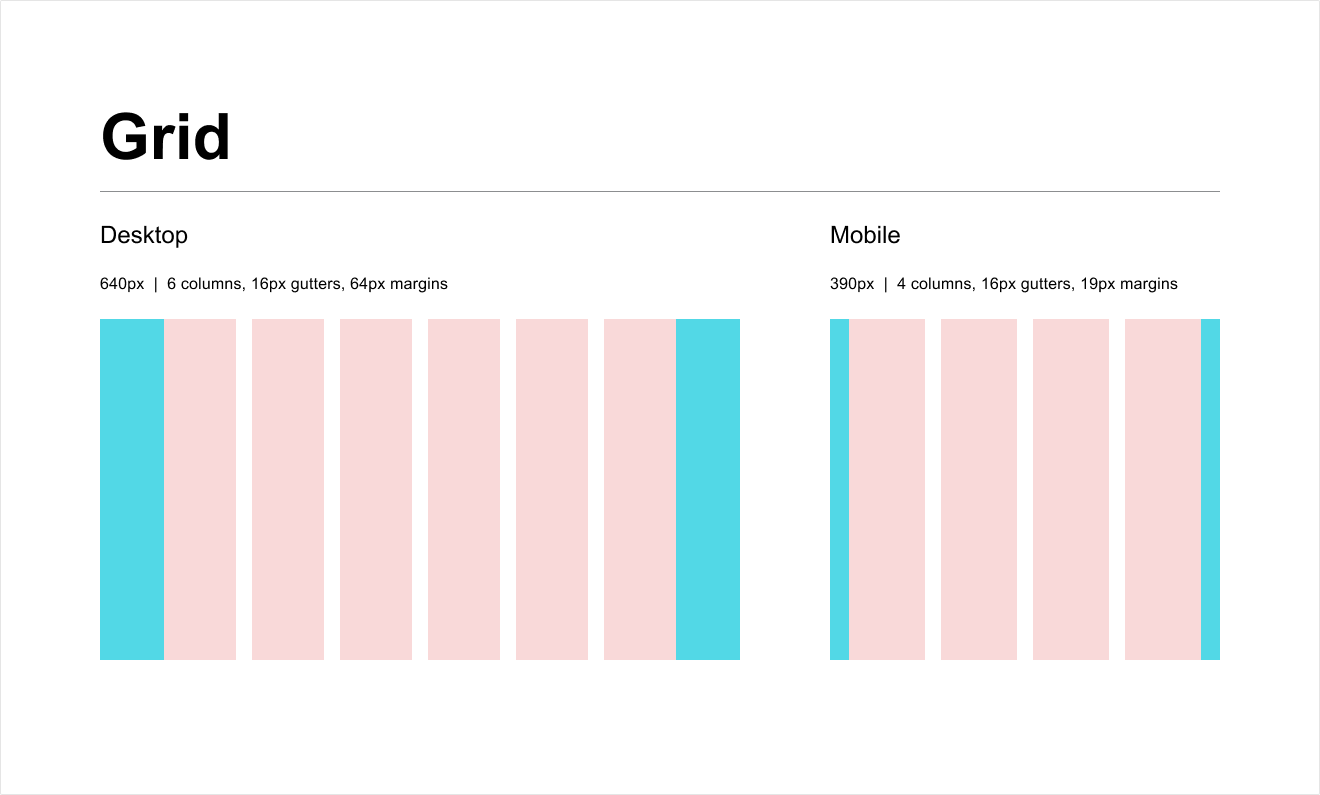
- Defined grid structures to ensure consistent layout across all email templates
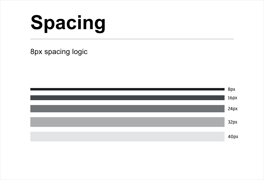
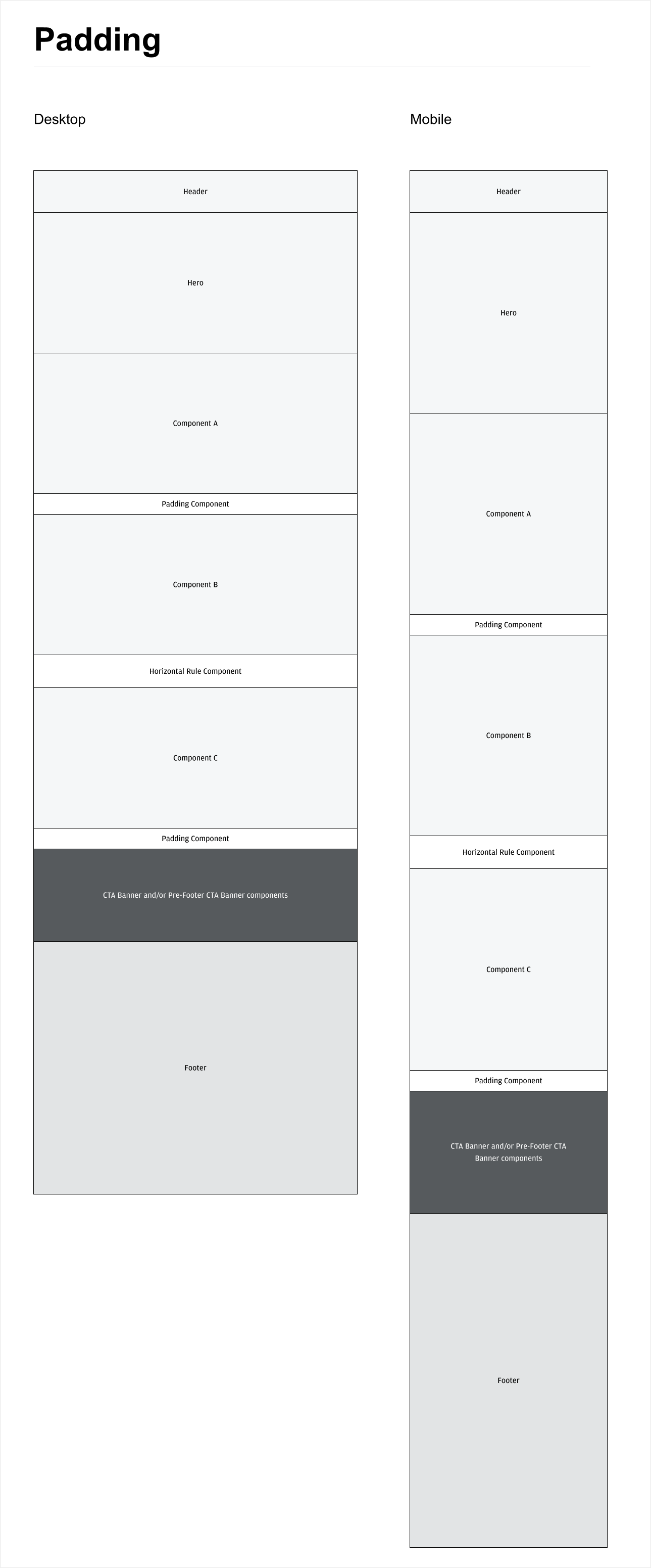
- Established spacing and padding tokens for uniform rhythm throughout components
Elements
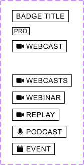
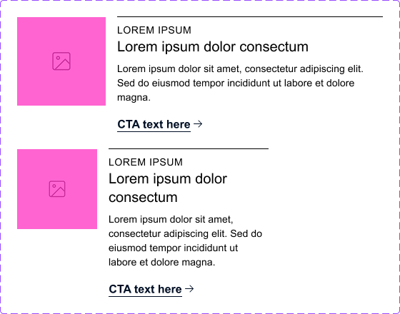
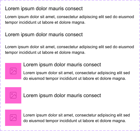
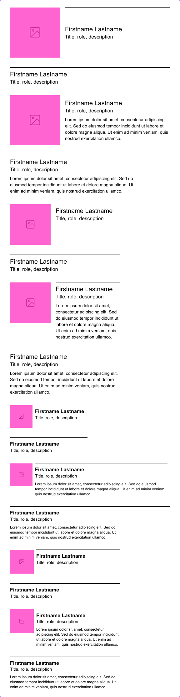
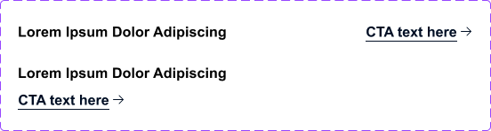
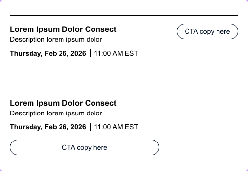
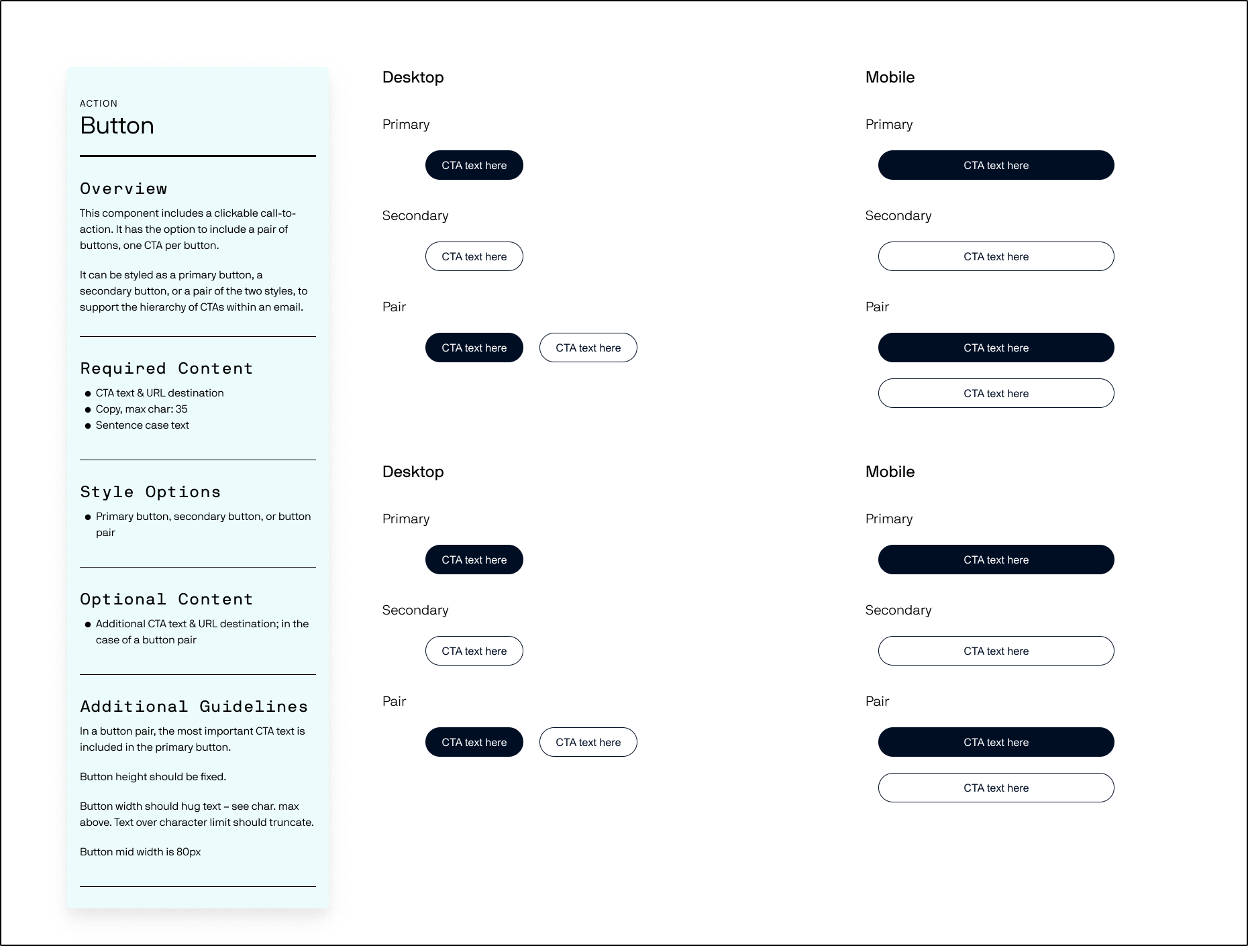
Elements are the smaller, reusable parts that make up larger components. Each element was designed to work independently and compose cleanly across all template types. Here are just a few from our extensive library. Hover to zoom on elements.
Buttons
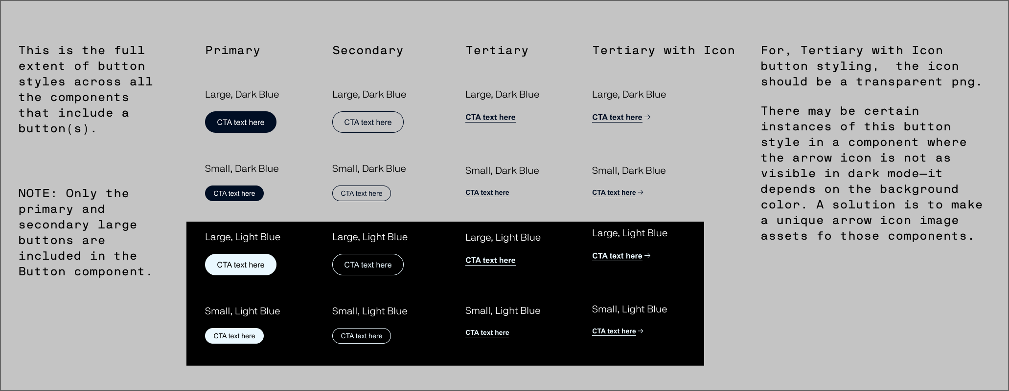
Buttons were originally designed with teal as the action color. When the brand refresh updated and teal was removed from the color library entirely, we had to pause and work directly with stakeholders to align on a new action color. The decision landed on a very dark navy blue. Something this seemingly small held up design decisions and blocked further component work, making it one of the more frustrating obstacles early in the process.
Component Library
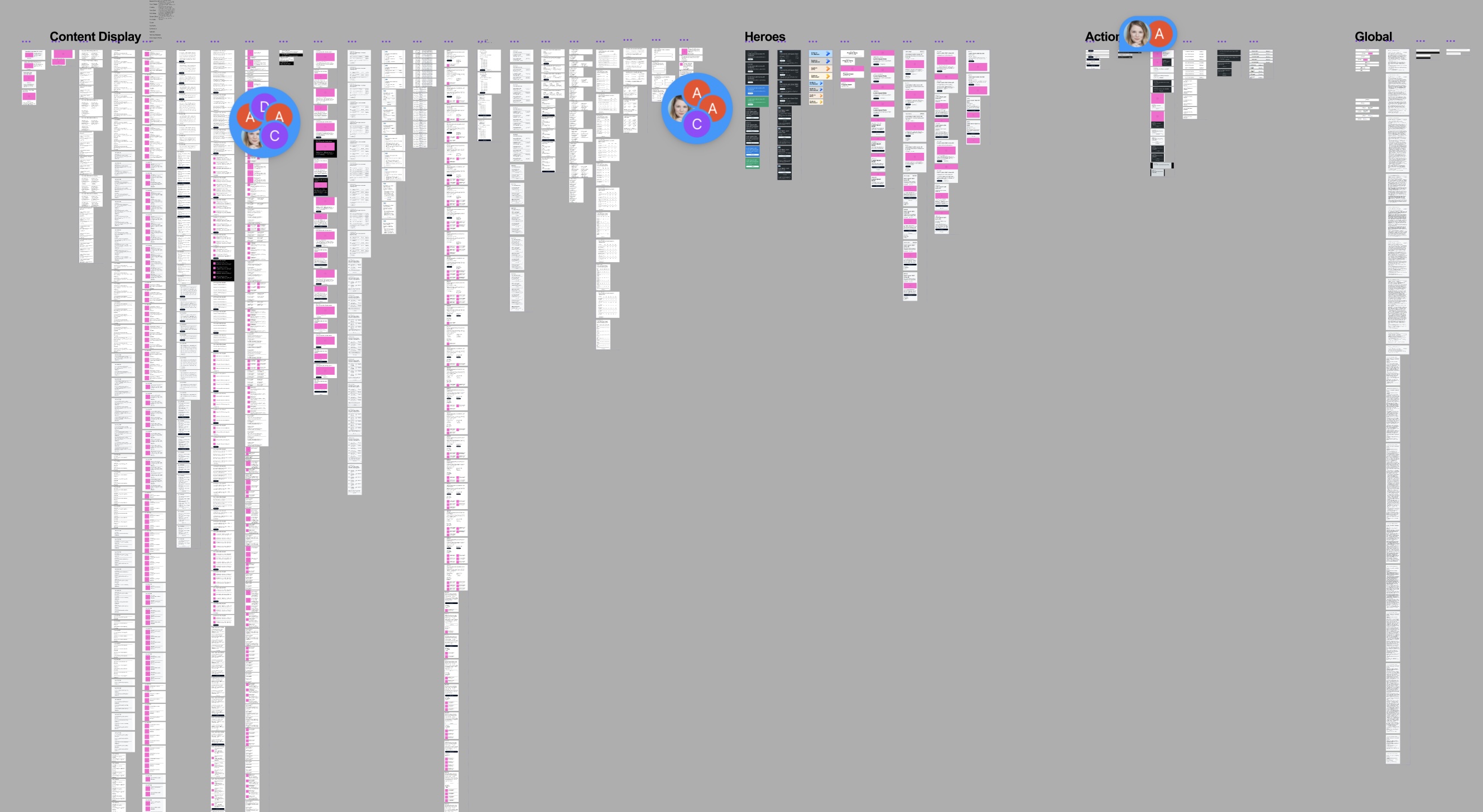
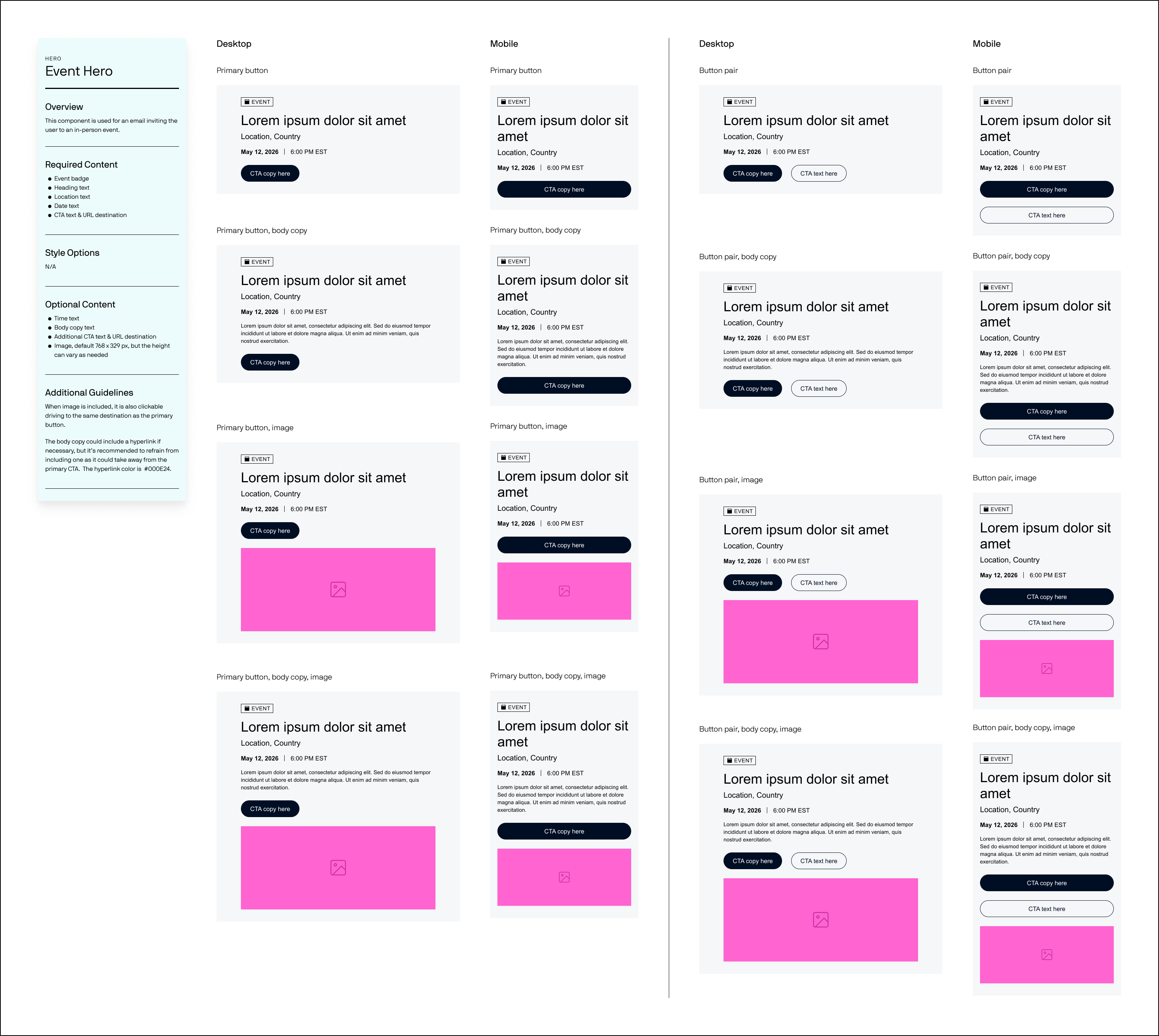
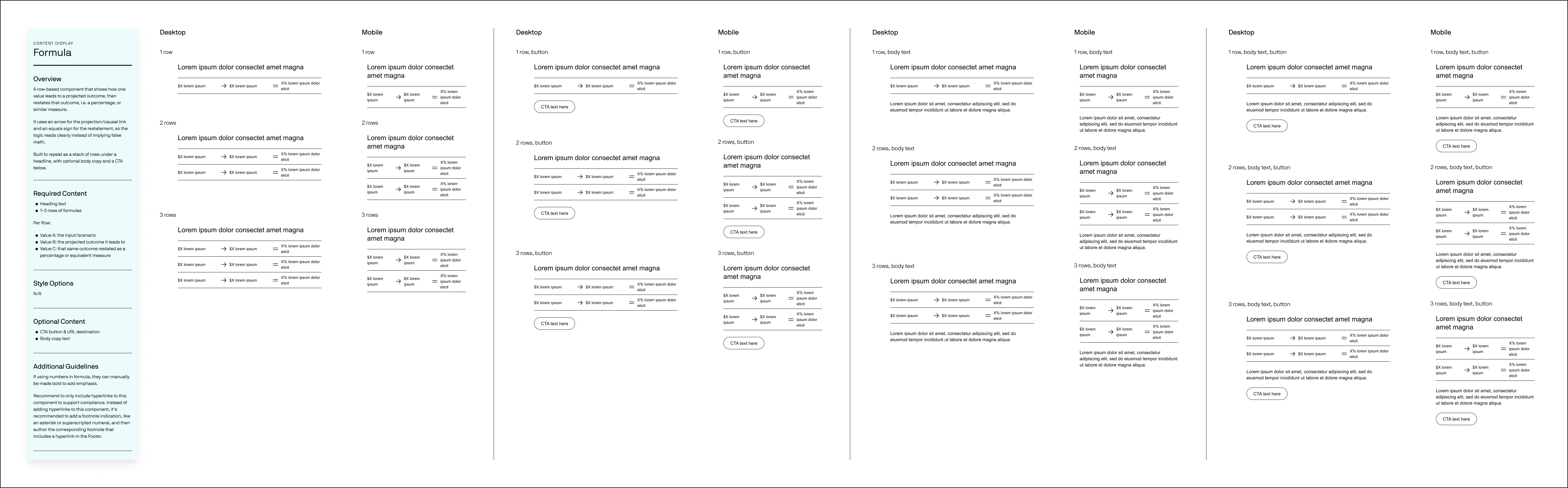
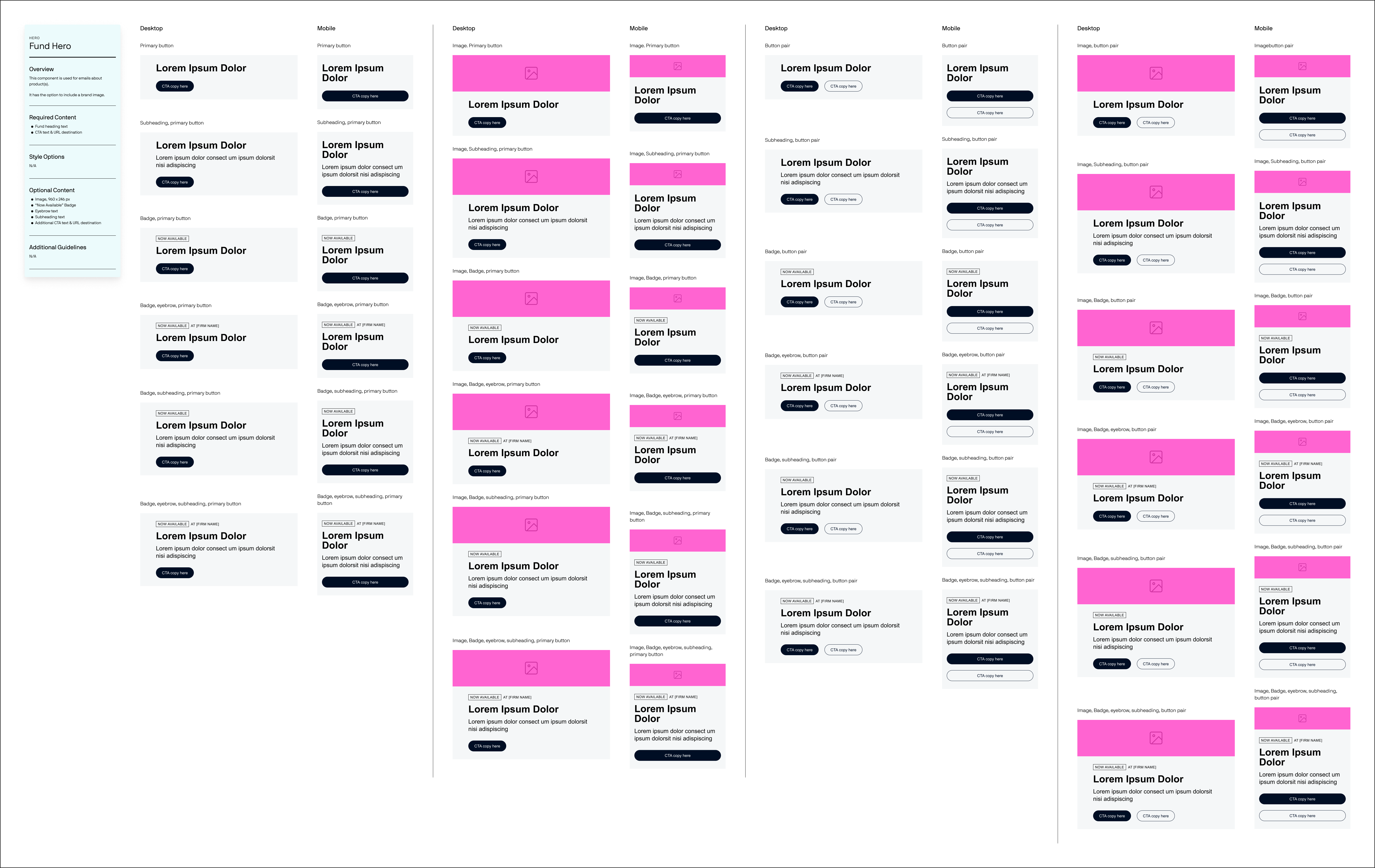
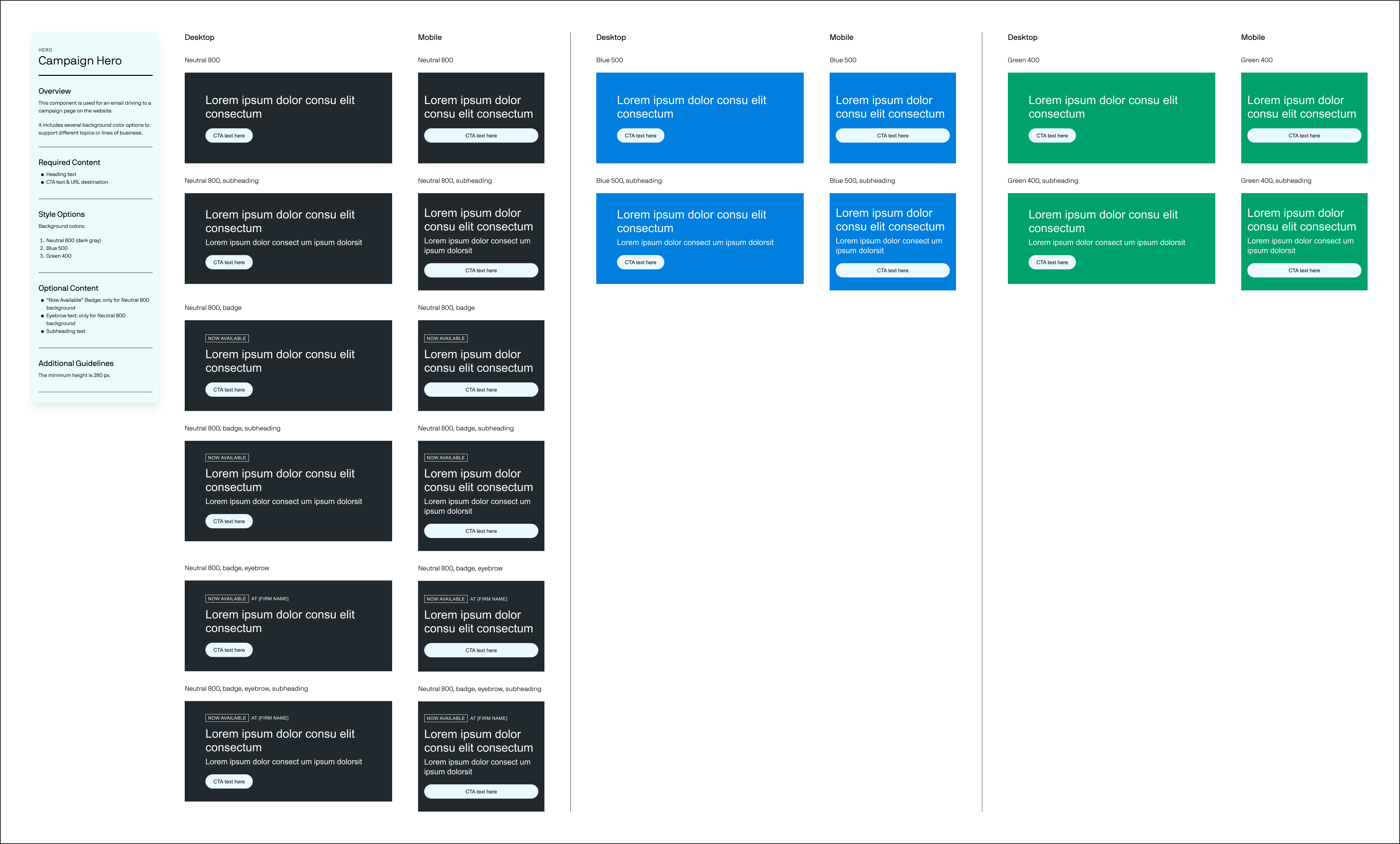
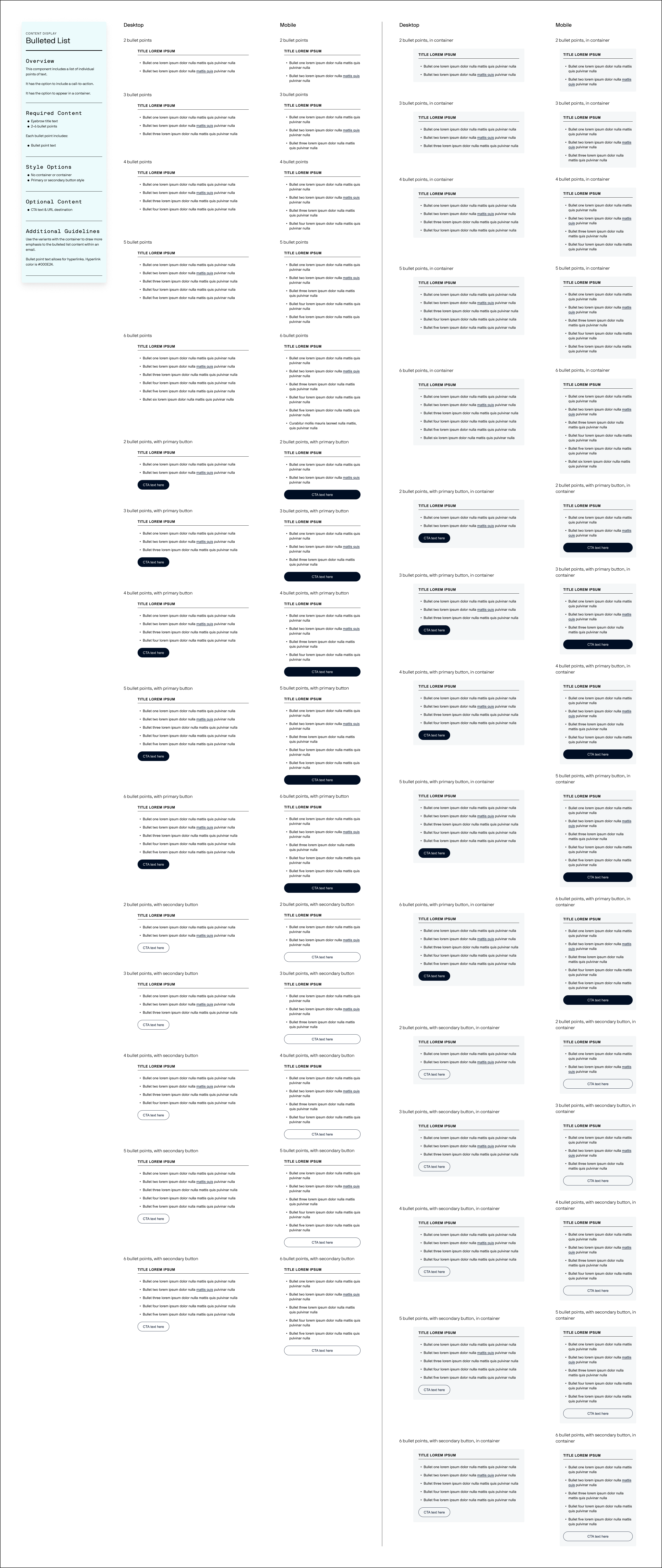
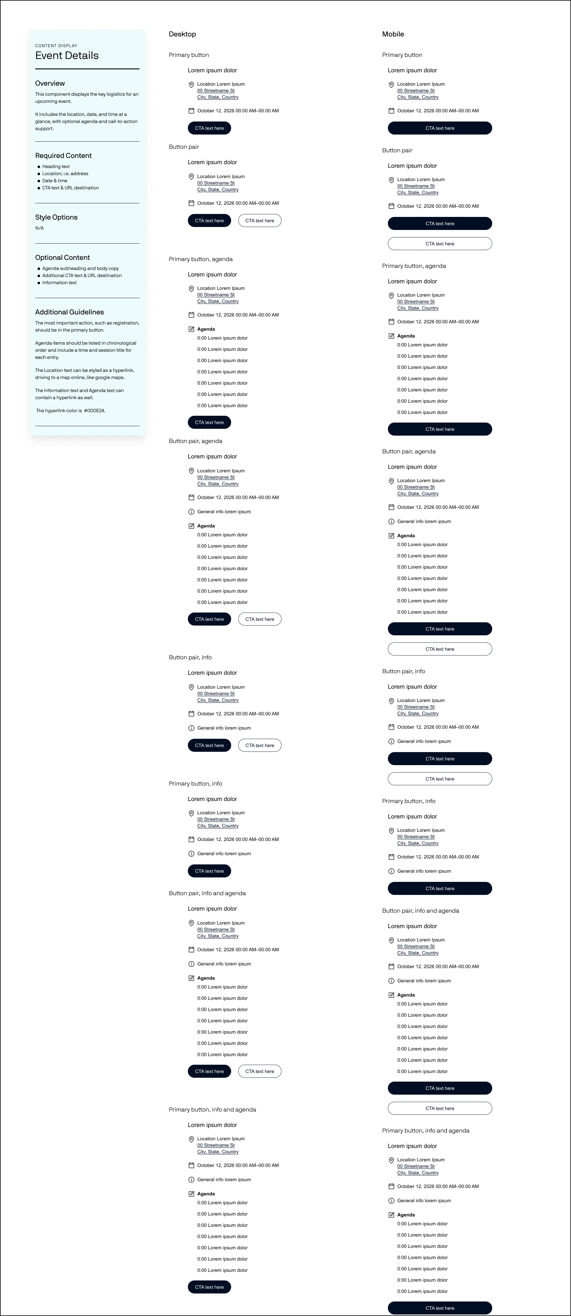
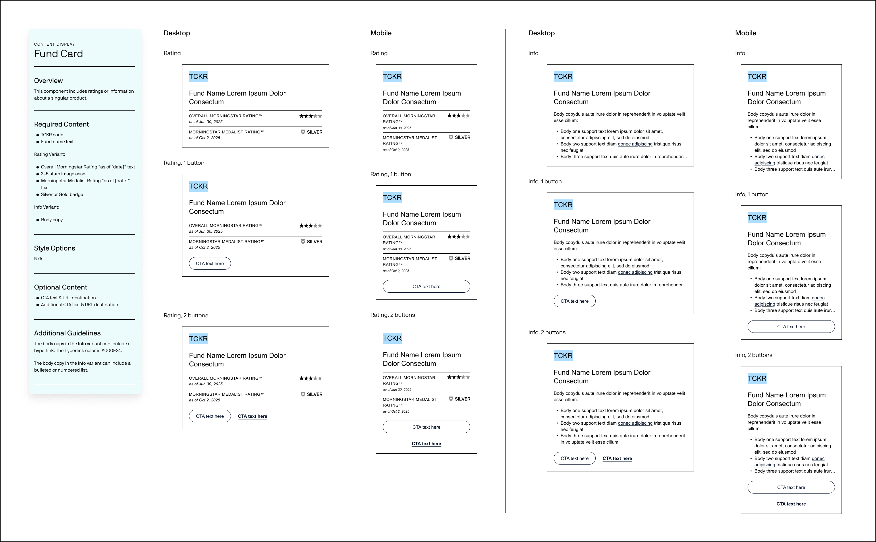
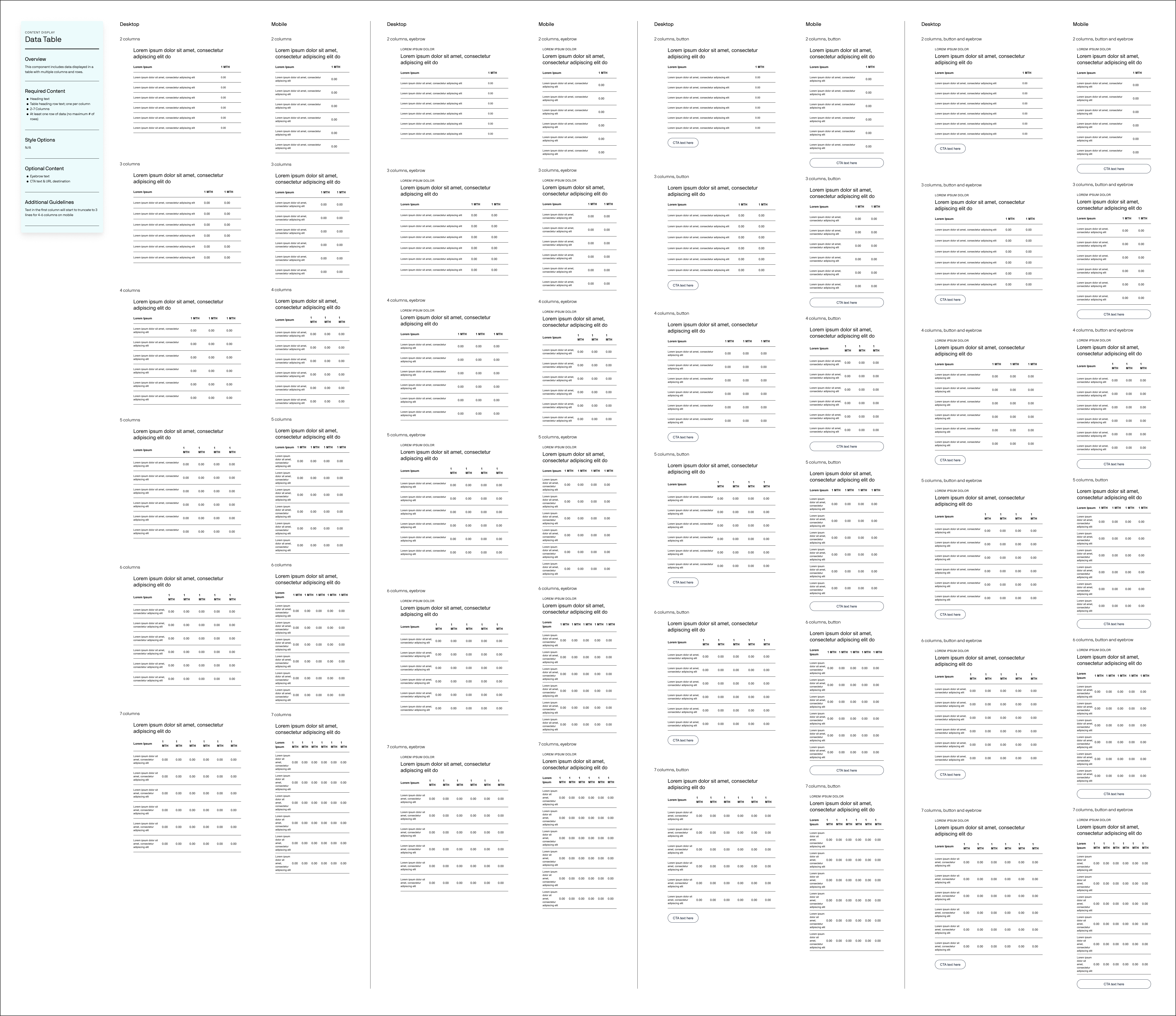
From there we started building out our extensive component library, annotating each component with strict guidance for engineers but also for marketers on content. Here is a screenshot of a huge chunk of our master components and then below certain components along with their Figma annotations. Hover to zoom on components.
Templates
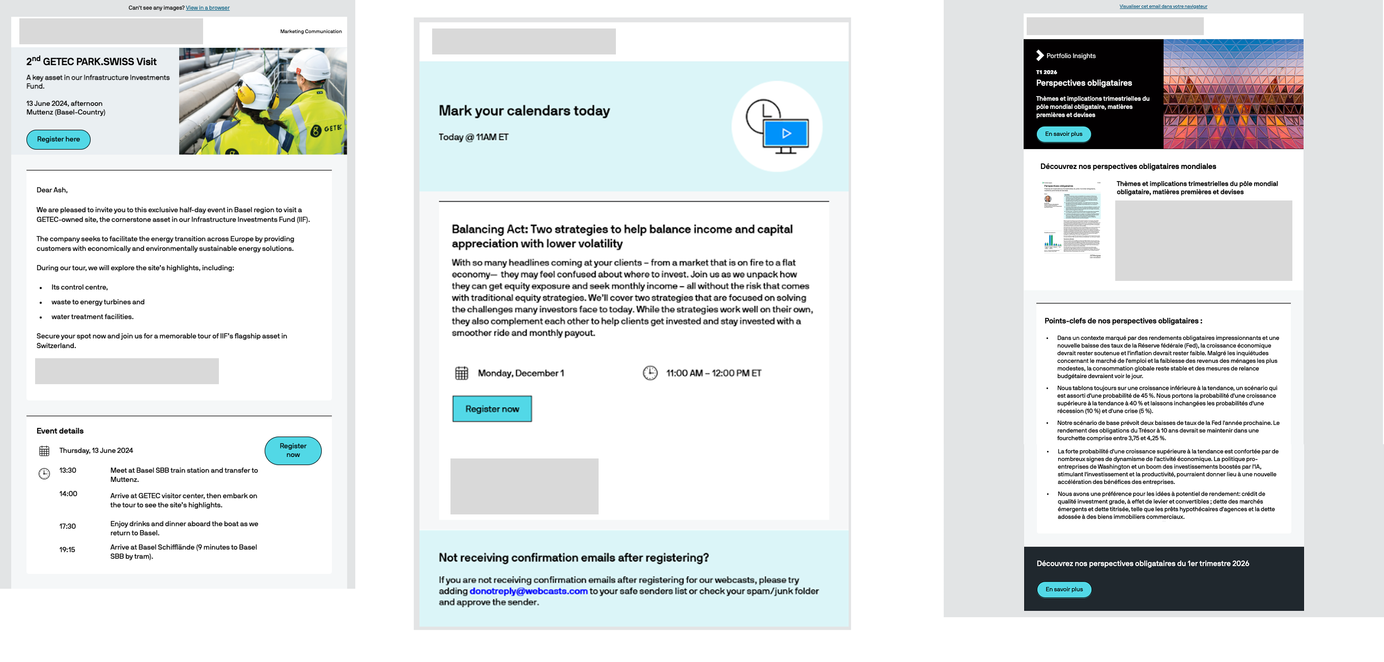
After we created a huge part of our design system we started creating email templates that we would need to review with stakeholders across the company. We needed to get a clear list of requirements and use previous emails to help us form the new design from our system. These covered a range of use cases across event invitations, newsletters, webcasts, and general purpose formats. Click to expand.
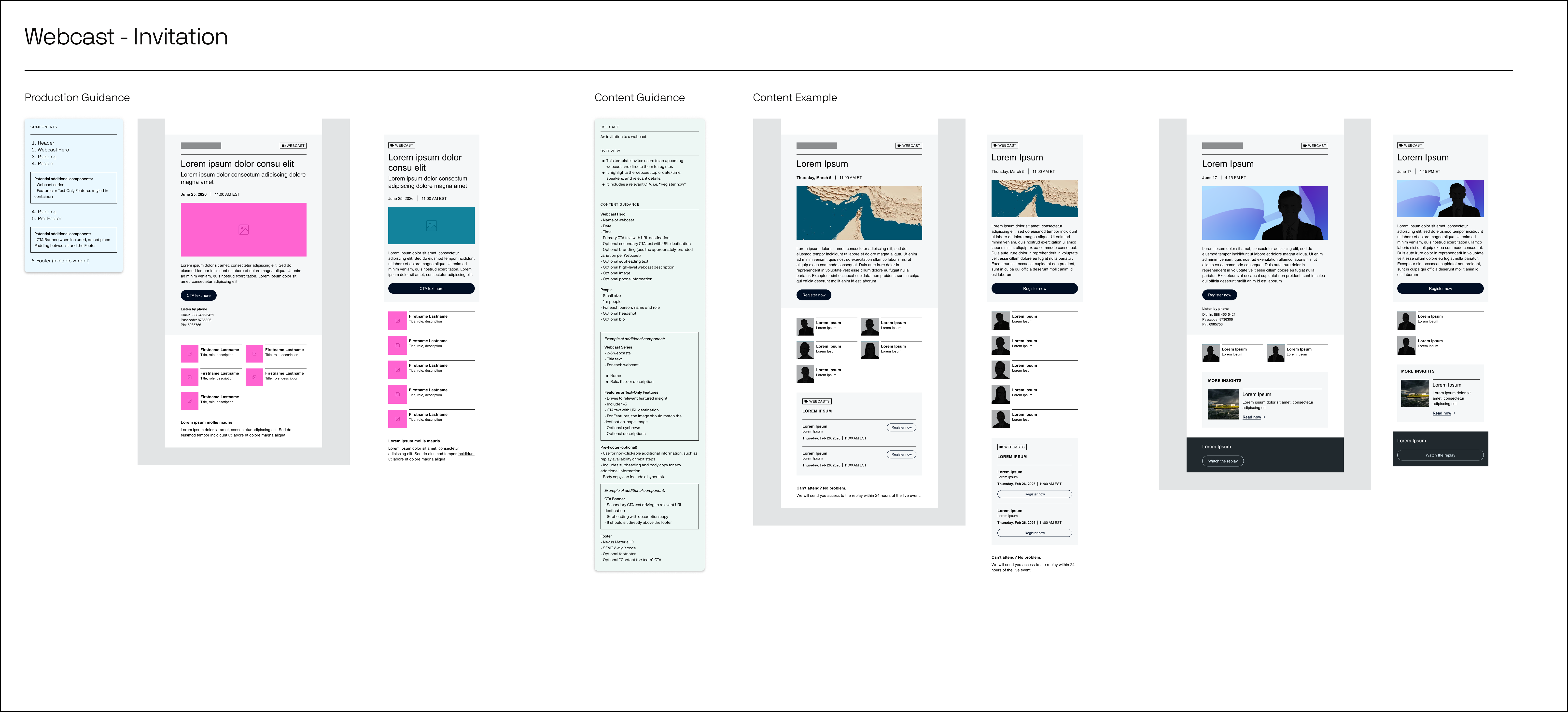
An example of an online event invitation email template with production guidance annotations for engineers and content guidance annotations for marketers.
What I Took Away
This project taught me what it truly means to build a full-scale design system from the ground up, but more than that, it sharpened how I navigate stakeholder relationships and manage evolving expectations. This has never been a linear process. Requirements shifted, new requests surfaced mid-flight, and priorities changed, all of which required constant adaptation and clear communication.
Now that we are approaching the final stretch, it is genuinely impressive to look back at how much we accomplished and the scale of transformation from where their email program started. The evolution speaks for itself.
One of the most valuable lessons I took from this project is that great design work does not begin and end with execution. You cannot always wait to be told what is needed next. The designers who stand out are the ones who stay curious, ask the right questions before they are asked, and proactively surface what a client actually needs rather than what they initially say they want. That mindset is what elevates a deliverable from technically correct to genuinely right.
Where We Are Now
This design system is currently being developed into modules for marketing teams to use and form email templates from. It is currently all being developed internally at the bank by AI. Therefore, all of our annotations and labeling had to be extra clear and precise, so AI systems and MCPs can develop our designs without room for interpretation. We are currently doing QA to work through all of this right now with engineers directly. The hope is to launch the new wave of emails by January 2027. Once these emails are published I will update this page with more documentation and images of our work.