384-Well Plate Map
Optimizing Cell Assay Workflows on the ProNect™ Data Platform
Project Overview
Optimizing Cell Assay Workflows from expanding 96-Well Plate Map Setup design to 384-Well Plate Map design on the Promega ProNect™ Data Platform.
Promega is a global biotechnology company that provides innovative solutions for life sciences. CellTiter-Glo is one of its flagship assays used to measure cell viability, and ProNect is a digital platform designed to streamline assay setup and data management workflows.
As part of a cross-functional initiative at Promega, I led UX design research to reimagine digital tools for 384-well plate mapping. Our goal was to improve workflows for scientists working in high-throughput areas like genomics, drug discovery, and cell-based assays by making plate setup more intuitive, accurate, and scalable. I built off the existing 96-well plate design to introduce dual-compatibility for more complex 384-well plate maps.
Note: This feature has not been published on the platform since my internship ended in December but is planning to be rolled out later this year.

Problem Statement
How might we extend the ProNect Data Platform to support both 96-well and 384-well plate formats so that scientists can seamlessly analyze experimental data across different plate types?
What is the ProNect™ Data Platform?

Current 96 Well Plate Workflow
Who are we designing for?
Ellie Roberts
Research Scientist — High-Throughput Screening
"I thrive on precision and efficiency"
Goals
- Throughput & Scale Handle large sample volumes without sacrificing accuracy.
- Reproducibility Ensure results are consistent across runs and operators.
- Design Experiments Set up hundreds of conditions in parallel to test hypotheses quickly.
Frustrations
- Manual setup bottlenecks in large-scale experiments.
- Setup complexity — higher density means more chances for human or robotic error.
- Poor scalability: tools aren't optimized for handling large plate volumes or repeated layouts.
Understanding how scientists actually work.
To build a foundational understanding of user workflows and preferences, we adopted a two-phase approach that began with qualitative discovery and transitioned into broader quantitative validation.
Internal Scientist Interview
We conducted a one-on-one interview with a Promega scientist deeply familiar with high-throughput workflows and 384-well plate usage. This session helped us map out the typical end-to-end process: from designing plate layouts to integrating with instruments and analyzing outputs.
Survey Design & Client Outreach
Building on our interview findings, I drafted a set of 15 potential survey questions to probe deeper into user roles, throughput levels, software habits, and pain points. After refining the content with our team, we distilled the survey down to 5 essential questions to reduce friction and increase response rate.
Biggest constraint was 4× Data Density
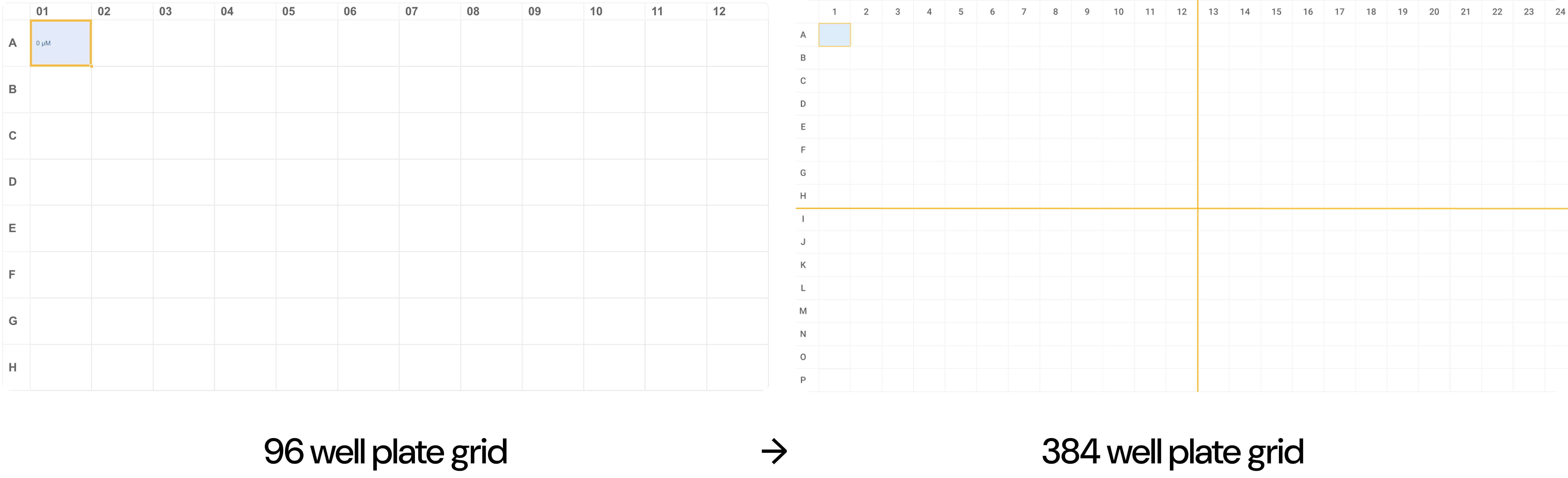
When we expanded from 96 wells to 384 wells, the total number of cells increased from 96 to 384 — an increase of 288 additional wells.
Mathematically, both the rows and columns doubled — from 8×12 to 16×24 — which means the total number of wells quadrupled. So we had four times the data density in the same visual space.
At 96 wells, users could comfortably scan the grid and visually detect inconsistencies. At 384 wells, each individual cell becomes significantly smaller. Scanning becomes more difficult. Errors become less obvious at a glance. Interaction targets shrink.
The interaction patterns that worked at 96 did not scale proportionally. So the core design question became: How do we maintain clarity and confidence while increasing density by four times?
Insights
We received initial feedback from scientists with varying levels of plate throughput (1–10 plates per week).
Tools Used
Excel & GraphPad Prism
The most common tools among respondents. Excel is accessible and easy to edit — a familiar baseline for most scientists.
Pain Points
Extremely Manual Setup
Excel setup is especially burdensome for 384-well formats — users must build 16×24 grids and label every well by hand.
Engagement
High Interest
Both respondents expressed interest in participating in future research — a strong signal for continued co-design opportunities.
Zoom Navigation for Dense Grids
One of the first pain points identified was the difficulty of navigating large 384-well plate layouts in Excel. Users often struggled to manually manage 16×24 well grids, making it hard to locate, edit, or review well-level data.
To address this, I introduced a zoom and quadrant-based navigation system to break the grid into manageable sections. This allowed users to:
Zoom out to see the entire plate for a quick overview.
Zoom into individual quadrants (A–D) for focused editing.
Navigate through quadrants using labeled tabs for clarity and speed.
This model dramatically reduced cognitive load while maintaining flexibility for users working at different scales.
Iteration 1
Iteration 2
Removed plus/minus zoom controls after feedback showed they added complexity without value. Focused the system on structured quadrant-based navigation for clearer, more intentional interaction.
Early versions only highlighted the selected quadrant border — too subtle at scale. Switched to a full color fill on the active quadrant, making the selected area immediately obvious.
Plate Type Flexibility
Dual compatibility for 96-well and 384-well plates. Users can now toggle between modes using a simple selector, ensuring the tool supports both high-throughput and standard lab workflows.
A toggle was chosen intentionally — with only two possible modes, a toggle is the clearest and most efficient control. It avoids the overhead of dropdowns or radio buttons and makes switching feel immediate and low-effort.
Enhancing Grid Legibility
Added yellow dividing lines to segment the 384-well grid into four logical sections (A–D), helping users quickly orient themselves and reduce cognitive load when scanning or editing dense data layouts.
Introduced a carousel at the bottom of the interface, allowing users to instantly recognize which grid section they're viewing and jump forward or backward between plate sections without losing their place.

Hover Preview in Fit Mode
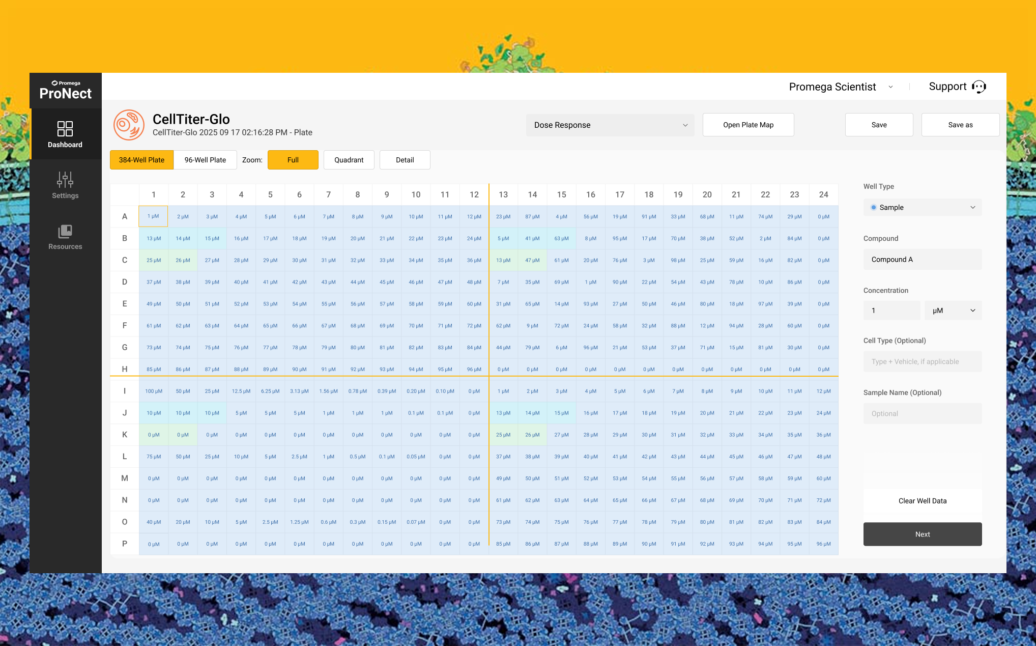
To enhance usability in the Fit (full plate) view, I introduced a hover-to-preview feature. When users hover over a cell, a tooltip appears showing the well's full metadata — compound, concentration, cell type, and more.
Flexible Zoom Levels & Mini Map
Added flexible zoom levels to better support different user workflows — from full plate overview down to high-precision single-column editing.
Zoom into two quadrants at once (A+B or C+D) for improved context when reviewing or editing adjacent regions.
Zoom further into a single quadrant displaying only six columns at a time — ideal for dose-response curves or replicates where detail and accuracy are critical.
A persistent mini toggle map stays visible when zoomed in, showing the full 384 layout with the active section highlighted. Users can jump between quadrants directly from the map, reducing disorientation and improving navigation efficiency.
This tiered zoom system helped users maintain both spatial orientation and fine-grained control without overwhelming the interface.
Client Demo
Outcome
75%
Faster setup
Reduced setup times by streamlining experimental configuration for life sciences researchers.
15/15
Client satisfaction
All clients were satisfied with the demo and rated both concepts highly.
2026
Planned launch
Iterations are still being made and will publicly be launched in 2026 on the ProNect™ Data Platform.
Key Learnings
Simplifying complex workflows through design
Working with high-throughput 384-well plate mapping taught me how essential it is to create tools that balance precision with ease of use. Many scientists rely on general-purpose software that does not fully meet their needs, so thoughtful design can significantly improve their workflows.
Progressive disclosure and usability
I learned the importance of progressive disclosure in interface design. Features like zooming into plate sections and navigating at different levels of detail helped reduce cognitive load, making the experience less overwhelming and more efficient for users.
Turning insights into practical solutions
By translating qualitative feedback from scientists into features like quadrant navigation and hover previews, I developed solutions grounded in real needs. This process highlighted the value of collaboration with cross-functional teams and showed me how small, incremental improvements can meaningfully support scientific work.