[Case 01]
Enhancing Cell Assay Workflows
BioTech

Enhancing Cell Assay Workflows
[Project Overview]
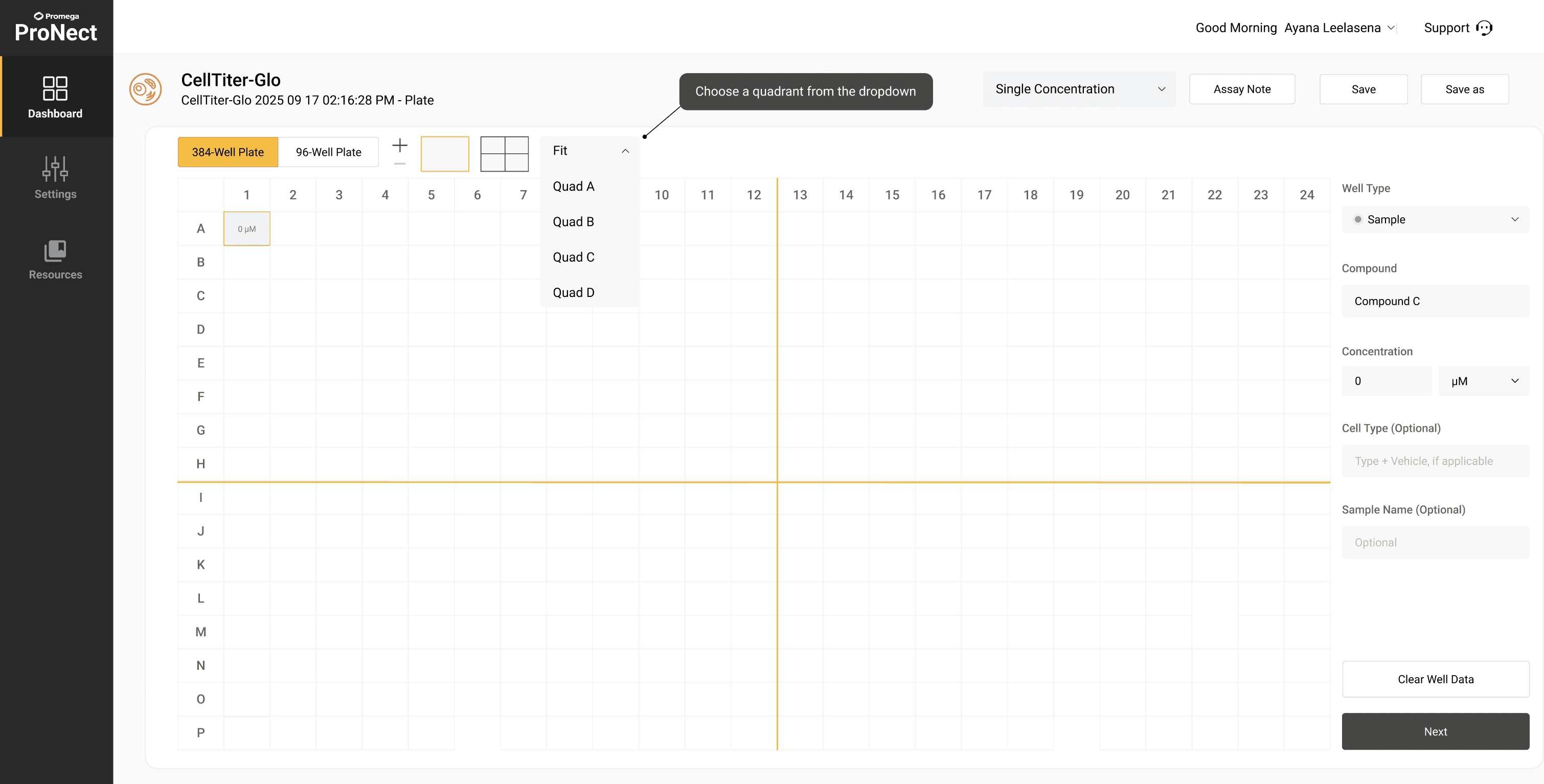
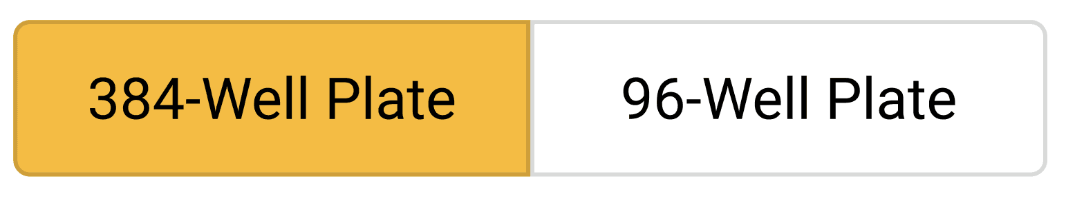
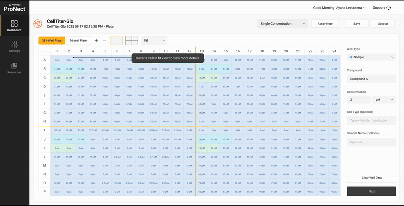
Optimizing Cell Assay Workflows from expanding 96-Well Plate Map Setup design to 384-Well Plate Map design on the Promega ProNect™ Data Platform.
This project is still ongoing and will be updated soon with clickable demo results, improved concepts, and post demo survey results.
[User Research]
How might we extend the ProNect Data Platform to support both 96-well and 384-well plate formats so that scientists can seamlessly analyze experimental data across different plate types?
Promega is a global biotechnology company that provides innovative solutions for life sciences. CellTiter-Glo is one of its flagship assays used to measure cell viability, and ProNect is a digital platform designed to streamline assay setup and data management workflows.
As part of a cross-functional initiative at Promega, I led UX design research to reimagine digital tools for 384-well plate mapping. Our goal was to improve workflows for scientists working in high-throughput areas like genomics, drug discovery, and cell-based assays by making plate setup more intuitive, accurate, and scalable. I built off the existing 96-well plate design to introduce dual-compatibility for more complex 384-well plate maps.
Industry
BioTech
My Role
UI/UX Design Intern
Platforms
Desktop
Timeline
July 2025 - Present
[Persona]

Ellie Roberts
I thrive on precision and efficiency
Age: 29
Location: New York City
Tech Proficiency: Moderate
Gender: Female
[Goal]
Throughput & Scale: Handle large sample volumes without sacrificing accuracy.
Reproducibility: Ensure results are consistent across runs and operators.
Designs Experiments: Sets up hundreds of conditions in parallel to test hypotheses quickly.
[Frustrations]
Manual setup bottlenecks in large-scale experiments.
Setup complexity — higher density means more chances for human or robotic error.
Poor scalability: Tools aren’t optimized for handling large plate volumes or repeated layouts.
[User Research]
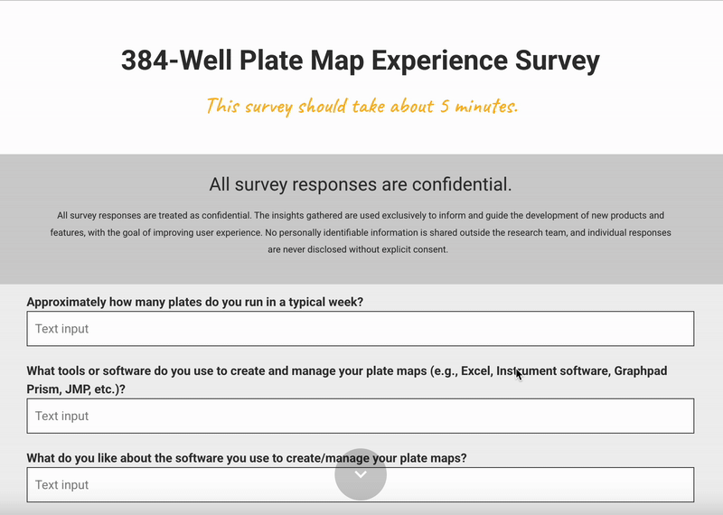
Foleon Survey we sent to cilents
[Insights]
[Design Solution #1]
[Design Solution #2]
[Design Solution #3]


[Design Solution #4]
[Design Solution #5]


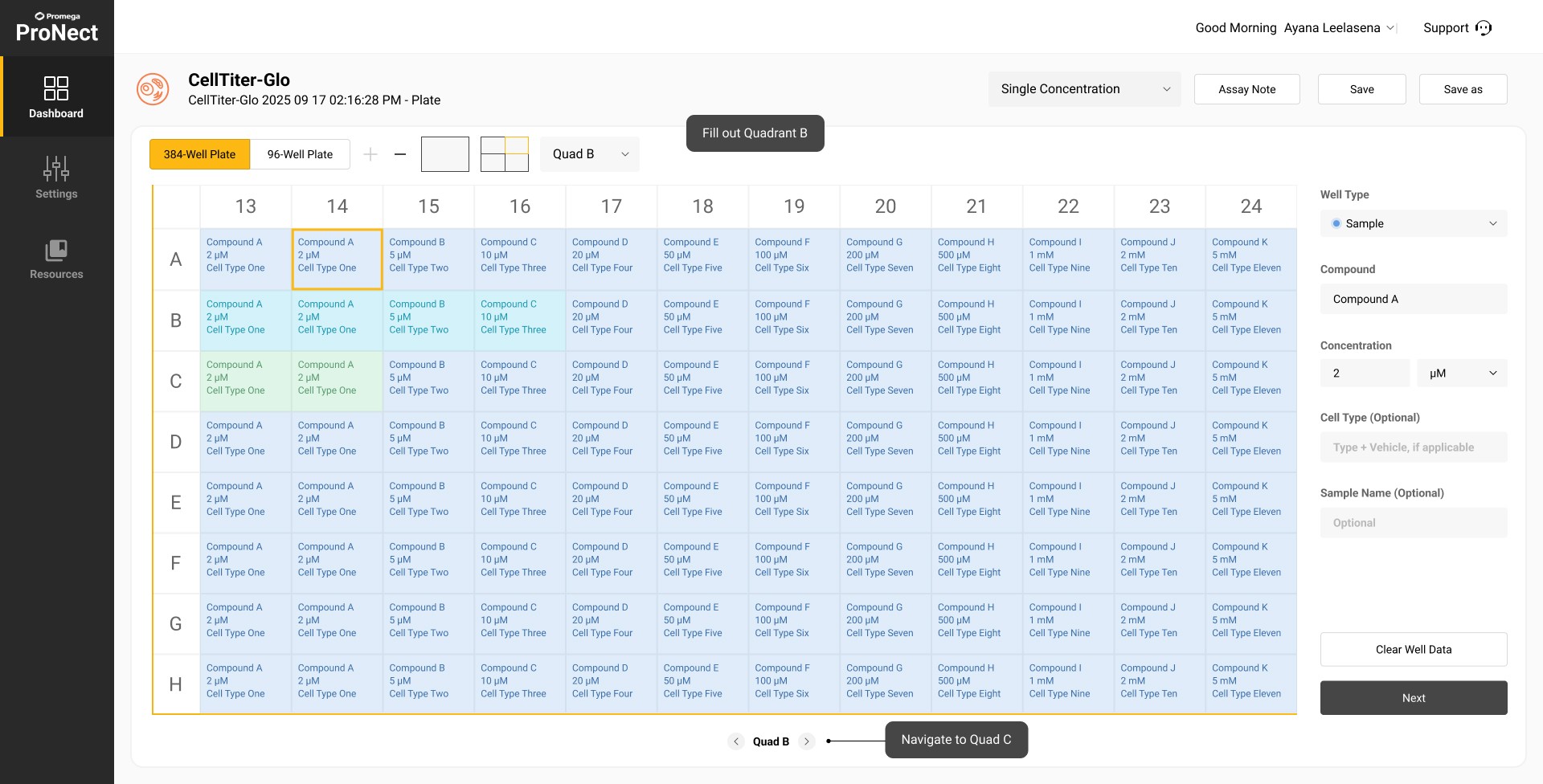
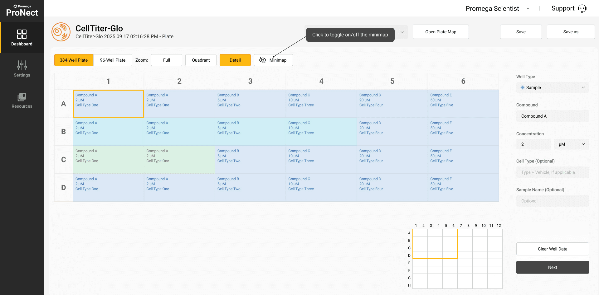
After a considerable amount of testing and design iterations we decided to add a mini map in concept B that can be turned on/off so the user can mentally visualize where they are located in the plate map:
[In Progress Client Demo]
[Outcome]
Reduced set up times by 75% and streamlining experimental configuration for life sciences researchers.
15/15 clients were satisfied with demo and rated both concepts highly
Iterations are still being made and will publically be launched in 2026 on the ProNect™ Data Platform.
[Key Learnings]
Simplifying complex workflows through design
Working with high-throughput 384-well plate mapping taught me how essential it is to create tools that balance precision with ease of use. Many scientists rely on general-purpose software that does not fully meet their needs, so thoughtful design can significantly improve their workflows.
Progressive disclosure and usability
I learned the importance of progressive disclosure in interface design. Features like zooming into plate sections and navigating at different levels of detail helped reduce cognitive load, making the experience less overwhelming and more efficient for users.
Turning insights into practical solutions
By translating qualitative feedback from scientists into features like quadrant navigation and hover previews, I developed solutions grounded in real needs. This process highlighted the value of collaboration with cross-functional teams and showed me how small, incremental improvements can meaningfully support scientific work.
Select this text to see the highlight effect