[Case 01]

UFinance

FinTech

Student Budgeting App

[Project Overview]

UFinance aims to empower students with the tools they need to manage their personal finances efficiently, reduce financial stress, and build better spending habits for the future.


[Problem Statement]

Students often lack clear visibility into their spending. Without intuitive tools, they fall into habits of overspending, forgetting due payments, and mismanaging money across multiple platforms (e.g., Venmo, Cash App, credit cards).

How might we help students easily track daily spending across categories like food, transportation, and entertainment to plan expenses and identify areas to save?

[Industry]

FinTech

[My Role]

UX Researcher and Designer

[Platforms]

iPhone

[Timeline]

September 2024- December 2024

[Persona]

Ashok Gupta

MBA Graduate student

I would say more or less discipline financially, I have a habit of tracking and managing my expenses closely

Age: 24 years

Location: Ann Arbor, MI

Tech Proficiency: Moderate

Gender: Male

[Goal]

Wants to easily track his expenses in an organized matter and have money saved to spend 3 months or so down the line.

He wants to retire early and set himself up for success long-term as well.

Struggles with spending money and not saving money

[Frustrations]

Spends a lot of time dedicating to manually entering costs and savings into spreadsheet. Would rather use that time towards his job and studies. 


Struggles to keep a tab of their physical receipts


Can’t manage a tally on both cash and digital money

[Process]

[01] User Research

User Interviews

We interviewed 10 college students (ages 18–26) with varied financial habits and tools (Excel, Mint, pen & paper). Key findings:

Familiarity Wins Trust 🔨 “I’ve been using Excel for years. I trust it more than apps because I can see exactly what’s happening.” Privacy is Paramount 🔒 “Privacy is always a concern when handling sensitive financial information.” Need for Visual Clarity 📊 “It would be great if apps categorized Venmo payments automatically.” Peer Pressure = Overspending 🛍️ “Living in NYC, it’s hard not to overspend—especially with my friends.”

[02] User Flows, IA, & Wireframes

We first created an Information Architecture of the entire app

We then created certain user flows including our goals feature

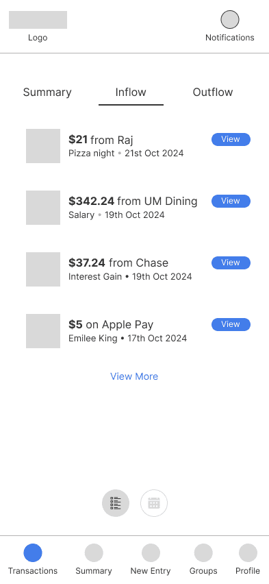
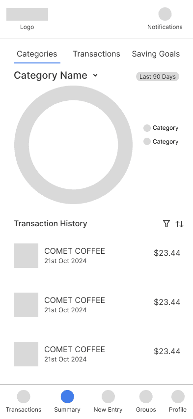
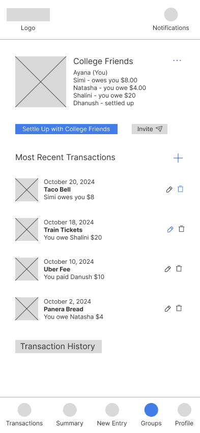
Then we sketched wireframes for all screens: Quick Entry 💲 Transactions & Goals 💰 User Profile & Notifications 👤 Summaries 📊 Groups 👥

[02] User Flows, IA, & Wireframes

We first created an Information Architecture of the entire app

We then created certain user flows including our goals feature

Then we sketched wireframes for all screens: Quick Entry 💲 Transactions & Goals 💰 User Profile & Notifications 👤 Summaries 📊 Groups 👥

[02] User Flows, IA, & Wireframes

We first created an Information Architecture of the entire app

We then created certain user flows including our goals feature

Then we sketched wireframes for all screens: Quick Entry 💲 Transactions & Goals 💰 User Profile & Notifications 👤 Summaries 📊 Groups 👥

[Click image to make larger and click image again to zoom out]

[Click image to make larger and click image again to zoom out]

[Slide the black middle bar to see before and after results]

[03 Usability Testing]

10 college students tested our prototype through structured, scenario-based tasks. Scenarios included: Add a new expense Create a group and split a bill Connect a bank account View spending breakdown Set savings goals

Key Issues Discovered: Goals Page: Confusing savings progress visuals Transactions: Unclear pie charts and terminology Bank Integration: Poor button placement and navigation flow Group Splits: Limited options and vague language

Iteration and Implementation Based on testing feedback, we made major improvements: ✅ Redesigned Goals Page with clear progress bars and simplified terms ✅ Updated Transaction Summaries with intuitive, accessible charts ✅ Streamlined Bank Integration for better navigation ✅ Introduced a Homepage with personalized financial overview ✅ Improved Group Features with better split options and confirmation screens

[04] Design Process #1

Design System

Before we started creating our high-fidelity designs based on our research we created a design system/brand guide to maintain consistency across all of our screens and reduce the development time.

Includes typography, color theory, margins, etc.

[04] Design Process #1

Design System

Before we started creating our high-fidelity designs based on our research we created a design system/brand guide to maintain consistency across all of our screens and reduce the development time.

Includes typography, color theory, margins, etc.

[04] Design Process #1

Design System

Before we started creating our high-fidelity designs based on our research we created a design system/brand guide to maintain consistency across all of our screens and reduce the development time.

Includes typography, color theory, margins, etc.

[05] Design Process #2

High Fidelity Mockups/Prototype

Created all screens based on iterative feedback from user testing and consistency from design system

Protoyped the entire app together using high fidelity mockups

[05] Design Process #2

High Fidelity Mockups/Prototype

Created all screens based on iterative feedback from user testing and consistency from design system

Protoyped the entire app together using high fidelity mockups

[05] Design Process #2

High Fidelity Mockups/Prototype

Created all screens based on iterative feedback from user testing and consistency from design system

Protoyped the entire app together using high fidelity mockups

[Click through embedded prototype]

[Outcome]

Refined prototypes through three testing cycles, leading to higher usability scores and increased confidence among student participants managing financial budgets by 80%.
10/10 users were satisfied by final product and would recommend to other students
40% improvement in perceived ease of use, as measured by post-launch user testing.

[Key Learnings]

Design for Students, with Students:

Direct collaboration with peers uncovered real budgeting struggles and guided solutions that felt practical, approachable, and empowering.

Design for Students, with Students:

Direct collaboration with peers uncovered real budgeting struggles and guided solutions that felt practical, approachable, and empowering.

Design for Students, with Students:

Direct collaboration with peers uncovered real budgeting struggles and guided solutions that felt practical, approachable, and empowering.

Clarity Over Complexity:

Even small interface improvements, like visual summaries and clear progress indicators, helped students feel more in control of their finances.

Clarity Over Complexity:

Even small interface improvements, like visual summaries and clear progress indicators, helped students feel more in control of their finances.

Clarity Over Complexity:

Even small interface improvements, like visual summaries and clear progress indicators, helped students feel more in control of their finances.

Iteration is Impactful:

Testing, refining, and retesting showed how incremental tweaks (not just big features) can meaningfully boost usability and confidence.

Iteration is Impactful:

Testing, refining, and retesting showed how incremental tweaks (not just big features) can meaningfully boost usability and confidence.

Iteration is Impactful:

Testing, refining, and retesting showed how incremental tweaks (not just big features) can meaningfully boost usability and confidence.

Select this text to see the highlight effect